THE LUCKY GOAT
London, UK
The Lucky Goat

Client: The Lucky Goat
Size: 5, 200 sq ft
Status: Complete
London, United Kingdom
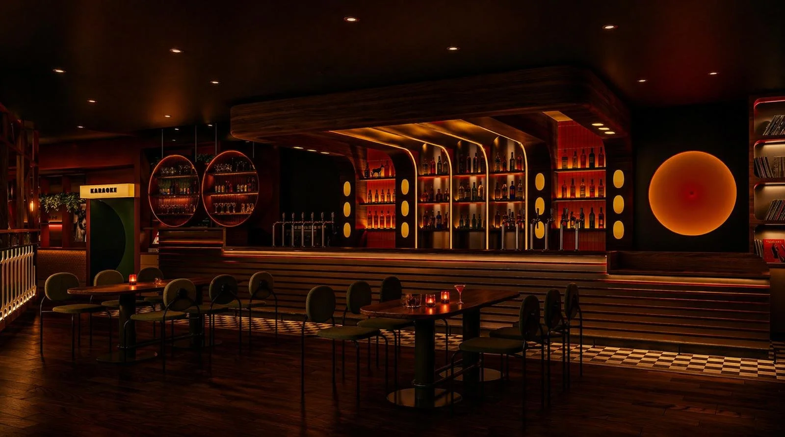
The brief was to create a competitive socialising venue for London, combining darts, shuffleboard, pool and karaoke within a cohesive environment.
Designed to encourage play, sociability and extended dwell time across multiple entertainment and hospitality experiences, the brief called for a space that feels textured, warm and lived-in, as if it's always been there. Not a venue people pass through, but one they want to work in. A space with the ease and familiarity of a local, elevated with just the right kind of mischief.
Working closely with the client, Zachary Pulman Design Studio was appointed to deliver the full project, including brand strategy, identity and interior design, conceived together from the first conversation to ensure a single, unified vision across every touchpoint.
Concept Strategy Brand Design Details
The Brief
Drawing inspiration from the warmth and character of a well-worn members' club, the design layers nostalgia with contemporary energy. Darts, shuffleboard, pool and karaoke are deliberately integrated with bar and lounge areas to create a seamless relationship between play, socialising and hospitality. Entertainment and drinks act as a unified experience rather than separate elements.
Spatial planning prioritises natural circulation and strong sightlines between attractions, allowing guests to move effortlessly through the venue. The layout supports both high guest capacity and the kind of relaxed, extended dwell time the brief demanded.
Warm amber lighting, circular geometry and checkerboard floors establish a visual language that rewards attention. Materials and details layer the space rather than decorate it, evoking somewhere that’s earned its character over time.
The result is a multi-layered social destination where play, drink and atmosphere work together to maximise guest engagement and support strong commercial performance. A stranger described it on opening night better than any brief could: kind of like your local. But not.
The Design
The brand was developed in parallel with the interior, not after it. The same conversations that shaped the layout shaped the identity, which is why the two read as one venue rather than a space with a logo applied to it.
The main figure in the logo is a goat reminiscent of a coat of arms, reworked in a fun, dynamic, modern guise. The goat's eye became the starting point for the wider system. The pupil, that strange horizontal rectangle that gives goats their unsettling, knowing stare, was treated as the primary module, then replicated, cut, rotated and resized to create three further modules. Used alone or in combination, they generate the cadences that run through signage, print, menus and the digital experience.
The result is a brand that behaves the same way the venue does. Familiar enough to feel like a local. Strange enough to keep you looking.